Timothy Moses
The experience designer and strategist doing the work.
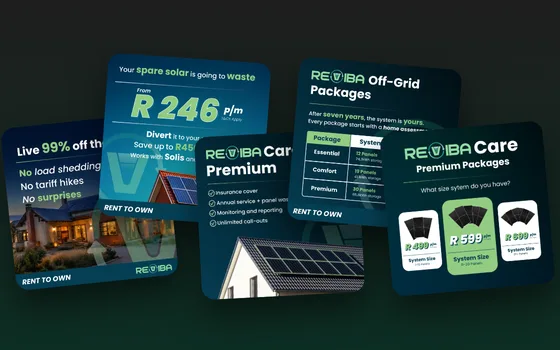 You’re here Reviba demand tests Heat pump: 362 leads, 5× baseline
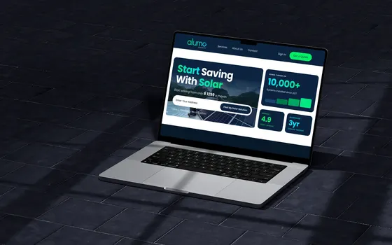 You’re here Alumo subscription portal 250 leads, 44% of all enquiries
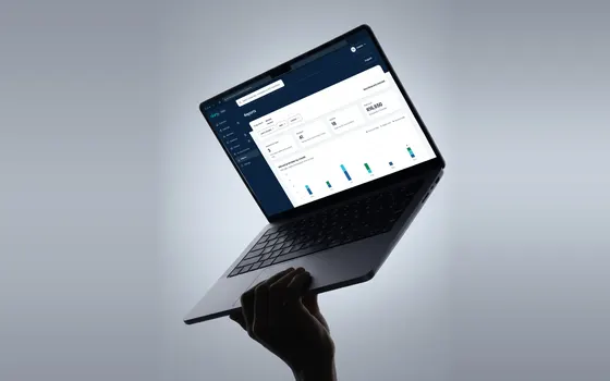 You’re here Alumo referral rewards 1,030 repeat referrers analysed
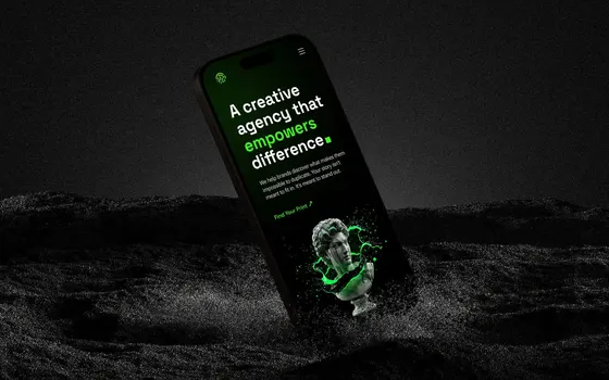 You’re here fngrprnt Founder · brand and web design
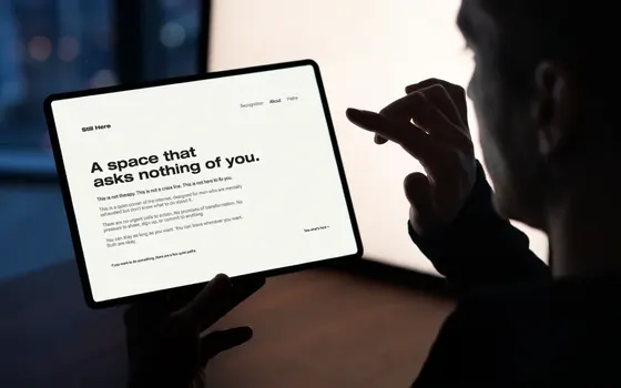 You’re here Still Here (opens Behance in a new tab) Clarity, trust and ease
Case study 04 / 04
The short version
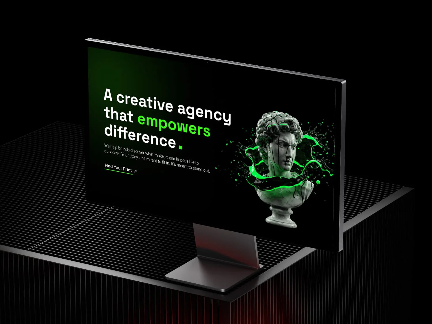
My own creative venture, built on one belief: different isn’t a problem to solve, it’s a strength to amplify. I shaped the philosophy, wrote the story and designed the website for a practice that helps brands discover what makes them impossible to duplicate.
The belief
Different isn’t a problem to solve. It’s a strength to amplify.
01
The mark
I’ve always felt there was something different about the way I see the world. I’ve never been interested in simply following the path everyone else follows. For a long time I didn’t have the language for it. I just knew I wanted to create, build and leave things better than I found them.
fngrprnt is where that became a practice. A fingerprint is the one mark nobody else can leave, and the name is a reminder of the job: help people and brands find theirs, then shape it with intent.
From the site’s founder story
“What makes you different makes you powerful. Your uniqueness isn’t a bug. It’s the feature that sets you apart in a world full of copies.”
02
The system
I separated three things that used to blur together. That made it clear what each one is for, and what the work underneath it should prove.
The experience designer and strategist doing the work.
The philosophy and the future agency the work sits under.
Continuous improvement: small, consistent improvements that compound over time.
Five territories, organised by the problem they solve
03
Who it’s for
The promise on the site is simple: uncover what makes a brand impossible to duplicate, then turn it into a competitive advantage.
The work is organised into three services, each with exactly what’s included written out, so nobody has to guess what they are paying for.
Before creating anything, understand everything. Discovery uncovers the unique story that makes a brand impossible to replicate.
Logo and brand mark, colour palette, typography system, brand guidelines and examples of it applied.
Narratives that connect emotionally and make a brand unforgettable. Stories that turn browsers into believers.
04
The website
It opens on the belief, not a list of services. The founder story sits at the centre as proof of the philosophy, and every page ends on the same invitation: find your print.
Even the contact form is on-message. It asks what makes your business different and where you want to go, not just your budget.
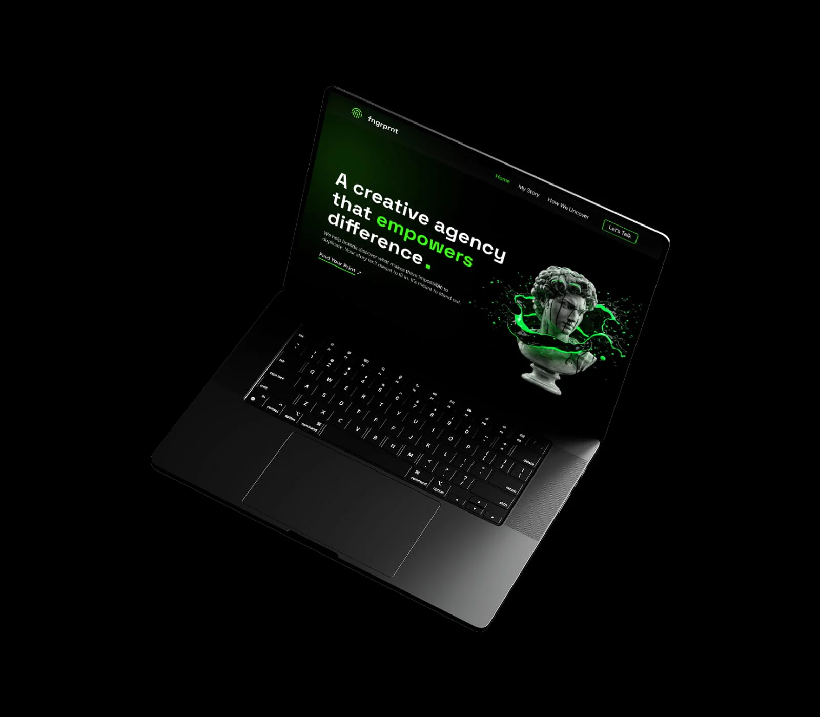
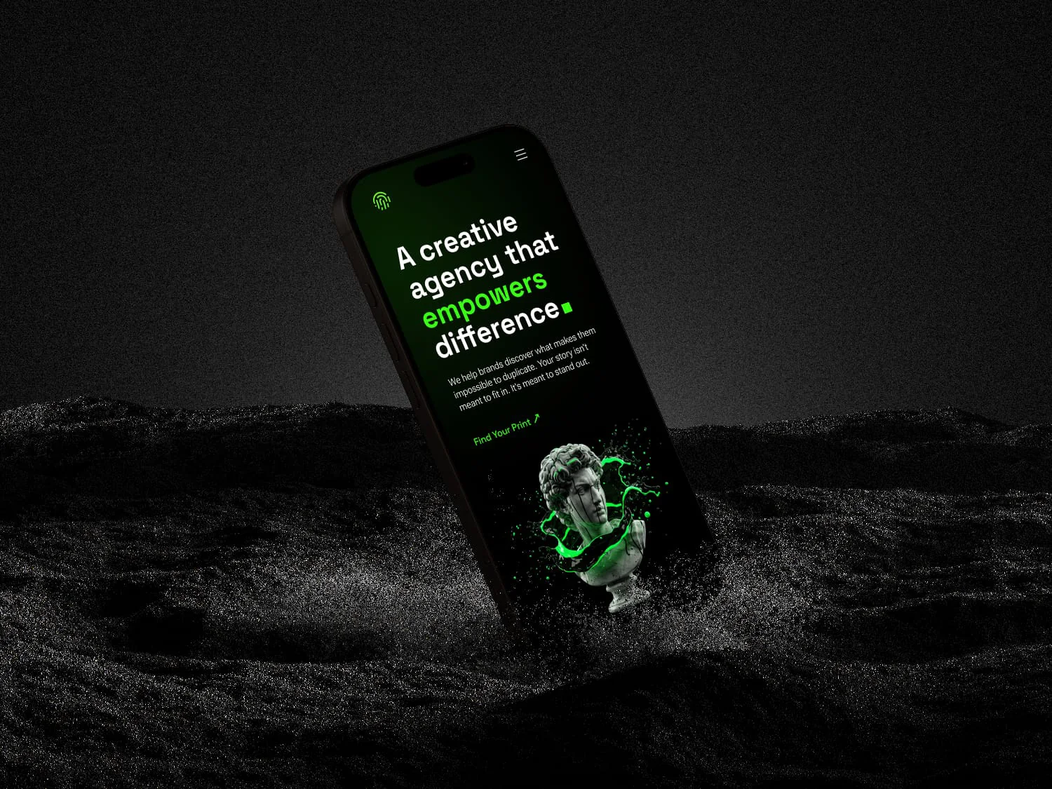
A creative agency that empowers difference.
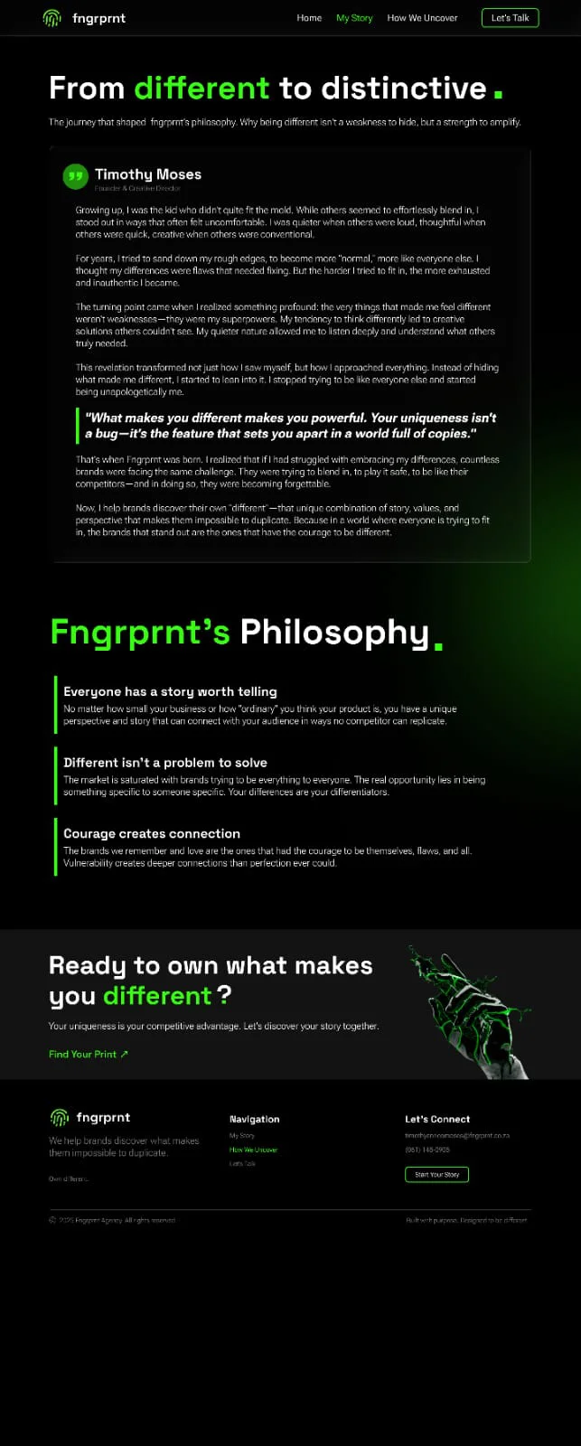
From different to distinctive.
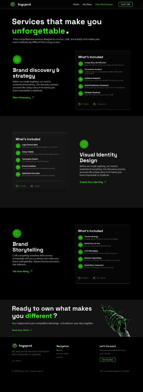
Three services, written out in full.
05
The philosophy
Everyone has a story worth telling
No matter how small a business is, or how ordinary its product feels, it has a perspective and story that can connect with people in ways competitors can’t replicate.
Different isn’t a problem to solve
The market is saturated with brands trying to be everything to everyone. The real opportunity lies in being something special to someone specific.
Courage creates connection
The brands people remember are the ones that celebrate their quirks and flaws. Vulnerability creates deeper connection than perfection ever could.
06
The identity
Round one explored a custom lowercase wordmark, a stamped seal and a generative fingerprint for every project. None of them felt like me.
I brought in references that were heavier, more geometric and more kinetic, and the next round moved towards a mark built from motion. The identity is still being refined, which is the point of the principle behind it.
07 Still becoming
This is my story. And I’m still writing it.
fngrprnt isn’t finished, and it isn’t meant to be. Small, consistent improvements that compound over time.
Back to the start · 01
Reviba demand tests
Read the case study →
Contact
Open to product design and UX roles, remote or in-house. The quickest way to reach me is email.
timothyenricomoses@gmail.com